NutriGold Retail Packaging
Retail packaging is the first physical touchpoint in a D2C or brick-and-mortar customer journey. Before anyone reads your website, watches your video, or clicks your ad, they see your label on a shelf. It either earns their attention or it does not.
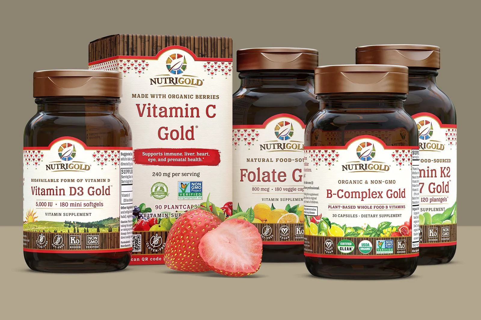
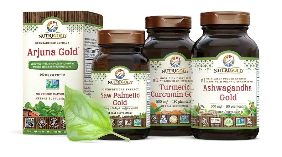
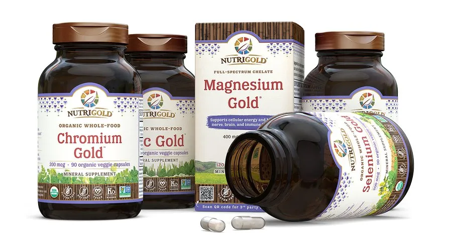
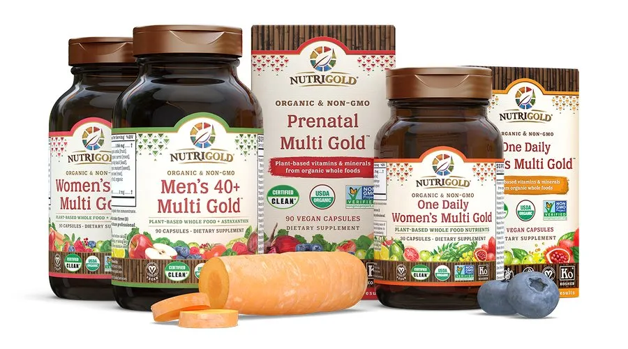
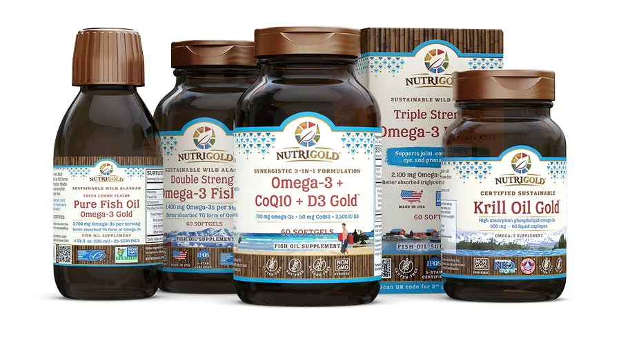
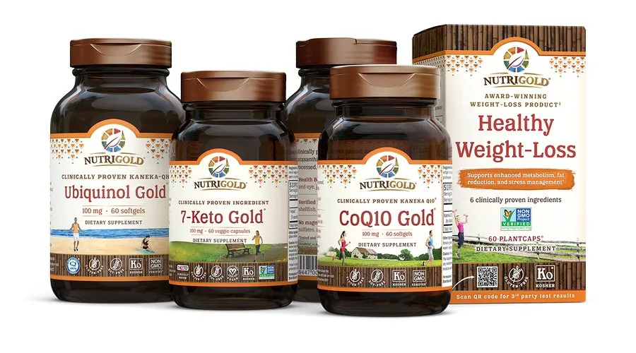
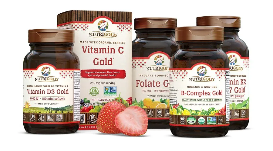
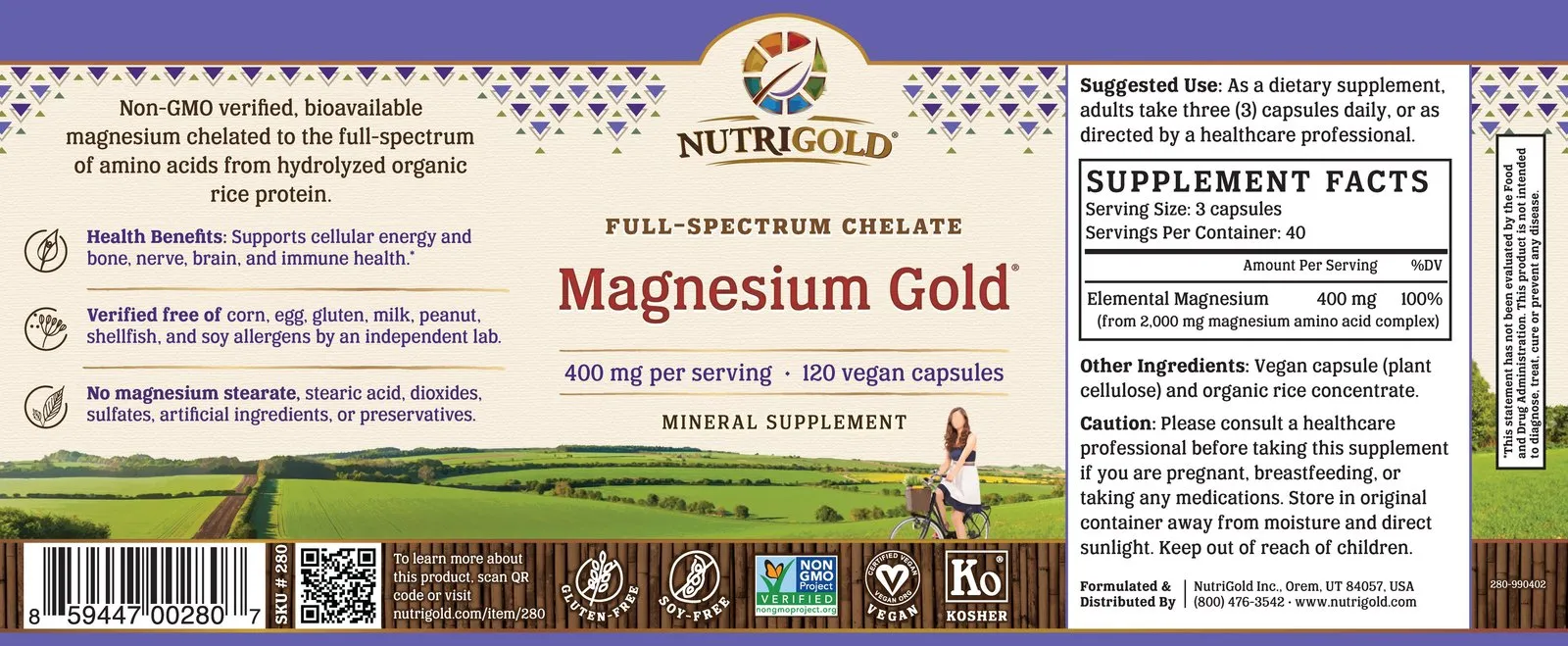
When NutriGold embarked on its brand overhaul in 2016, the packaging redesign was the most visible and highest-stakes deliverable. I joined the company at the start of that effort and was handed responsibility for the full execution: primary panel layouts, side panel structure, and the development of the unique illustration artwork that would run along each product’s lower border.
The “Fresh Expressions” illustration style I created for this project became the brand’s signature visual language, appearing across packaging, retail collateral, trade show materials, and digital channels for years afterward. Its adoption at focus group review confirmed what the strategy had anticipated: buyers in the natural products space respond to visual cues that communicate freshness, care, and craft.
The packaging redesign was not a creative project. It was the visual foundation of NutriGold’s retail acquisition and D2C growth strategy.