“Neo” Design System
Brand consistency is a conversion lever. When every touchpoint, from a trade ad to a sales deck to a product landing page, looks and sounds like the same company, buyers develop the kind of subconscious trust that accelerates deals and reduces sales cycle length.
When I joined Central Semiconductor as Senior Marketing Communications Manager, the brand was inconsistent by any standard. Materials produced by different vendors and internal contributors varied widely in color use, typography, and tone. For a company trying to expand its position in competitive B2B verticals, that ambiguity was costing credibility at every touchpoint of the customer journey.
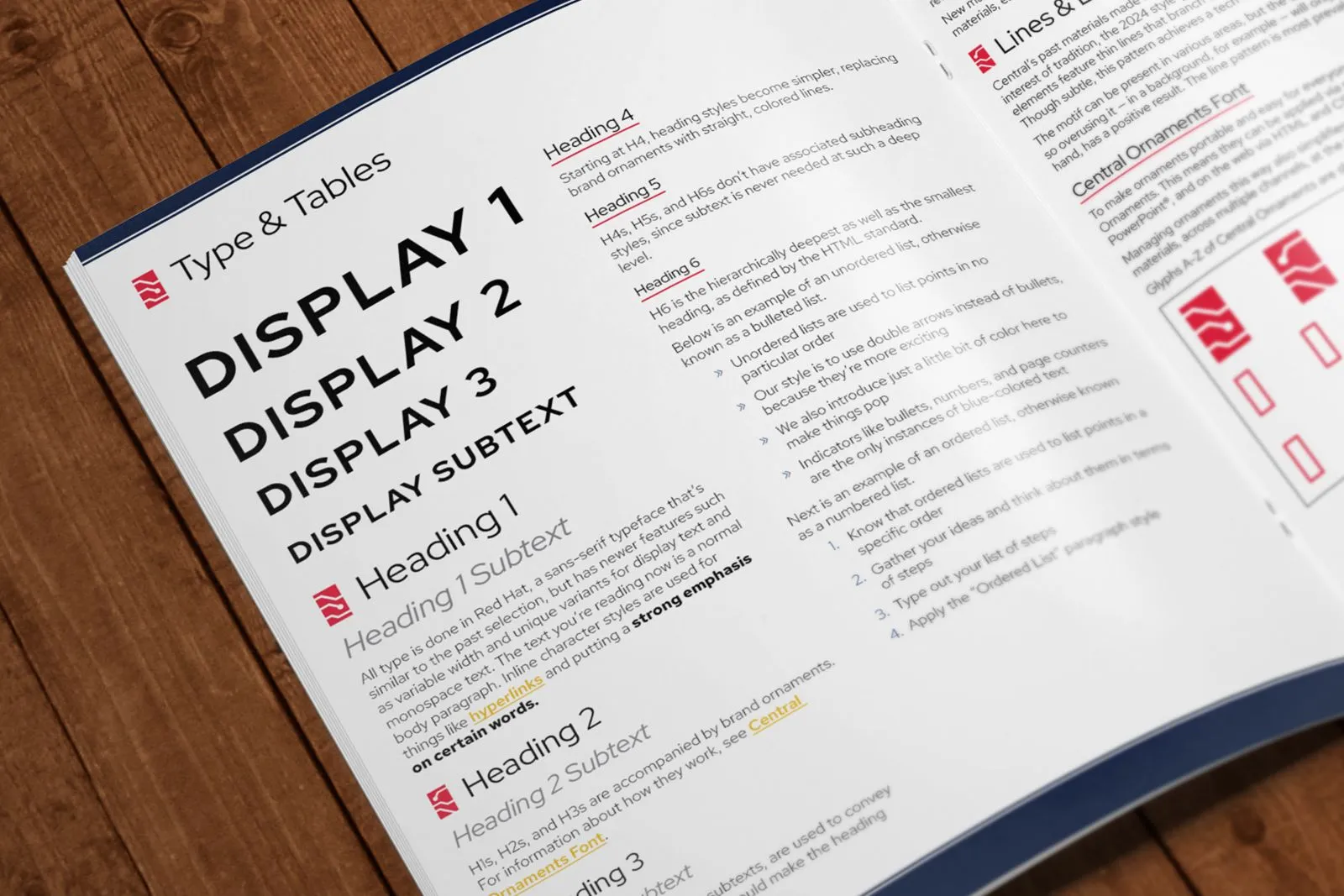
I developed a comprehensive design system, which I named “Neo,” that codified Central’s visual identity from the ground up. New color standards, typeface rules, graphic styles, and layout principles were documented clearly enough that both in-house designers and outside vendors could apply them without interpretation errors. The guide also addressed past inconsistencies directly, giving the team a reference point for what to correct going forward.
Within months of implementation, conversion rates on sales enablement materials improved by 35%, reflecting how much friction had been removed by simply making the brand legible and trustworthy to buyers.